
Led a 2-month project to create a modular email design system that would help Square sellers identify legitimate emails and reduce financial losses from phishing scams.
Square faced a surge in phishing scams targeting sellers, resulting in significant financial losses.
In 2020, Square faced a surge in phishing scams targeting its sellers, resulting in significant financial losses. Many sellers were unable to tell apart genuine Square emails from fraudulent ones, which shook their confidence and increased their vulnerability to scams.
The inconsistent design and branding across Square's email communications made it difficult for sellers to immediately recognize authentic messages, creating an urgent need for a cohesive email design system.
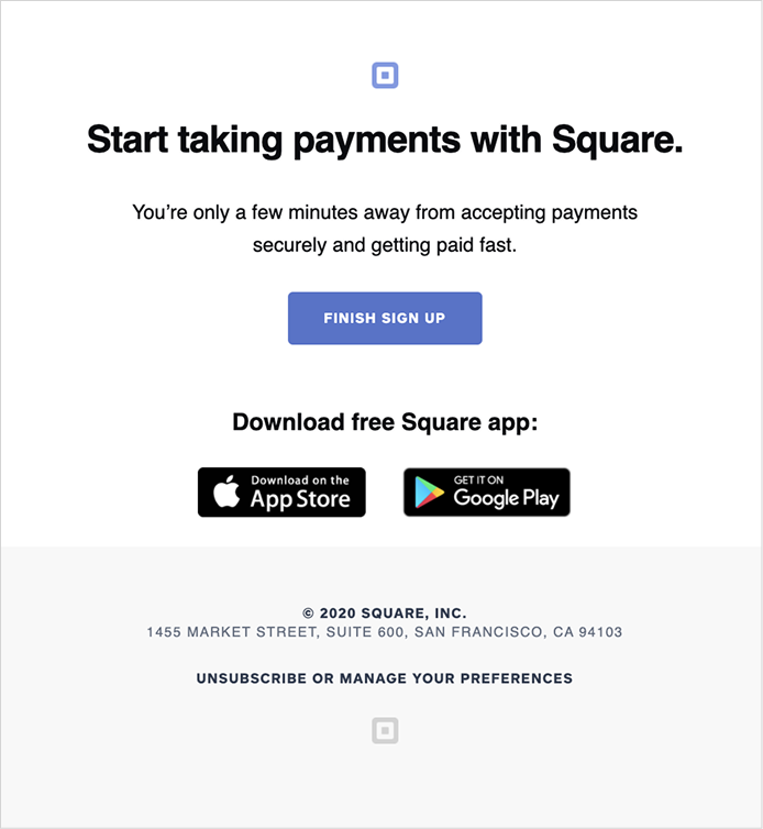
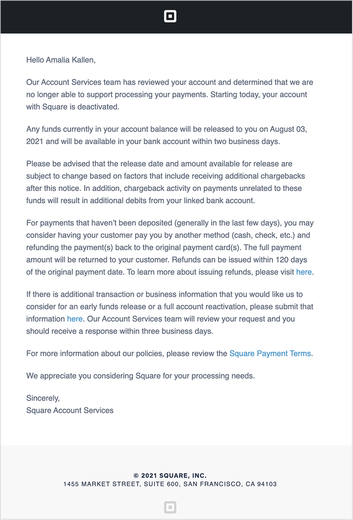
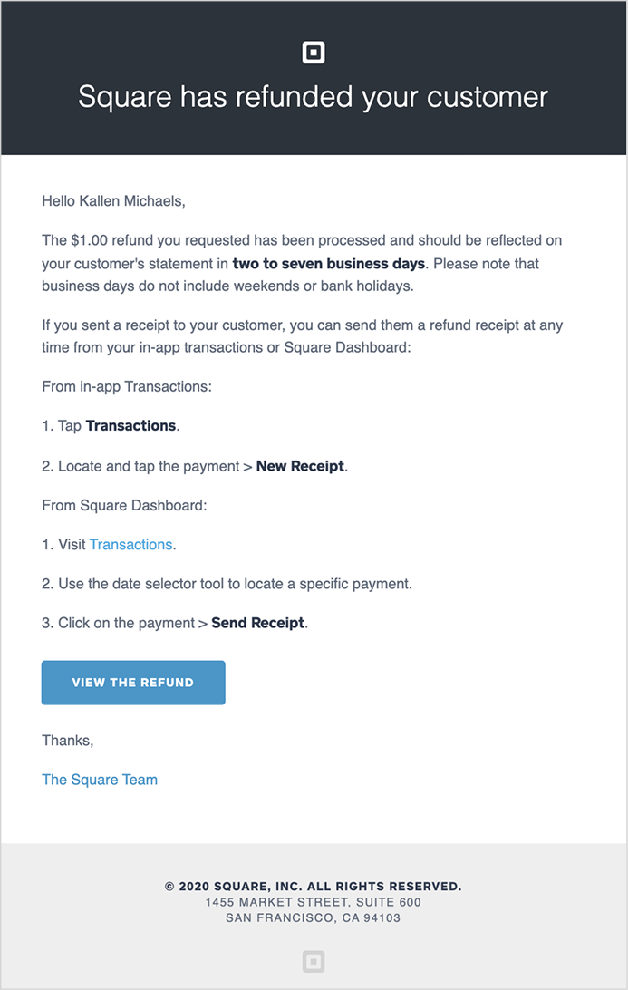
If you can spot the phishing email, I will give you $20
"I don't really click on the emails anymore, I just check my dashboard or wait for you guys to text me."
This feedback highlighted how the phishing problem was eroding seller trust in all Square communications, not just fraudulent ones.
Our objective was to boost seller trust by making emails instantly recognizable as authentic Square communications.
Our mission was twofold. On the business side, we needed to boost seller trust by making emails instantly recognizable as authentic Square communications, thereby reducing financial risk from phishing scams. On the design side, we needed to create a scalable, modular way of designing new emails that ensured consistency, improved visual recognition, and streamlined updates across the organization.
Stakeholder workshops and comprehensive email audits laid the foundation for our modular design system.
To gain buy-in for this new initiative, I conducted weekly workshops with stakeholders from each department alongside my design partner to understand their specific needs, while communicating our concerns and design goals.
By analyzing the full scope of existing emails across departments, we compiled a comprehensive list and identified inconsistencies. This foundation set the stage for creating a cohesive and modular email design system.
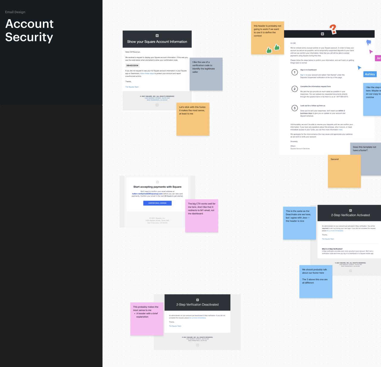
Cross-departmental workshops to understand stakeholder needs and audit existing emails
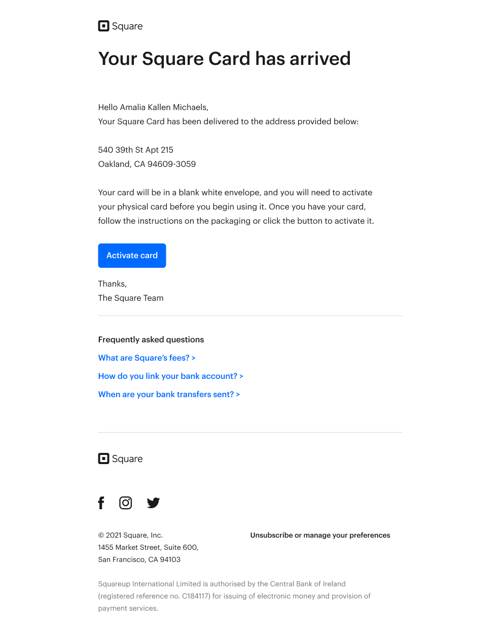
Leveraging the Market design system, we created a set of email-specific components with consistent headers, bodies, and footers. The design system team had a very clear goal of repurposing as many components as we could.
My design partner and I designed a few early versions for different email types and iterated on the designs during weekly critiques to refine the visual and functional elements, while staying within the original design system.
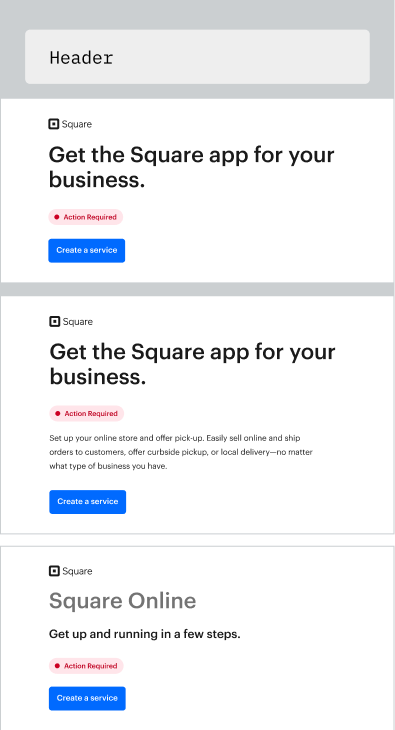
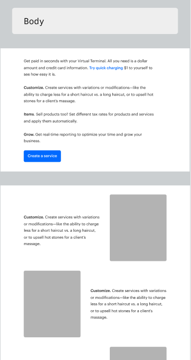
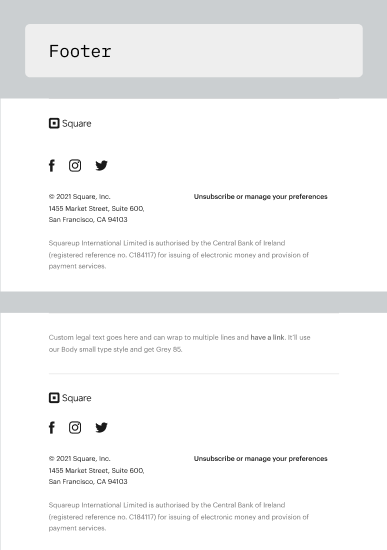
Modular components: headers, bodies, and footers for consistent email design
To gauge the impact of the redesign, I teamed up with a UX researcher to develop a research plan and conducted qualitative usability tests with sellers. We focused on key metrics—seller confidence, click-through rates, and a reduction in phishing incidents.
Next, we ran a large-scale A/B test to compare the redesigned emails with the existing versions. With quantitative backing, our team implemented the designs using custom HTML through Contentful, ensuring a smooth integration for the marketing team.
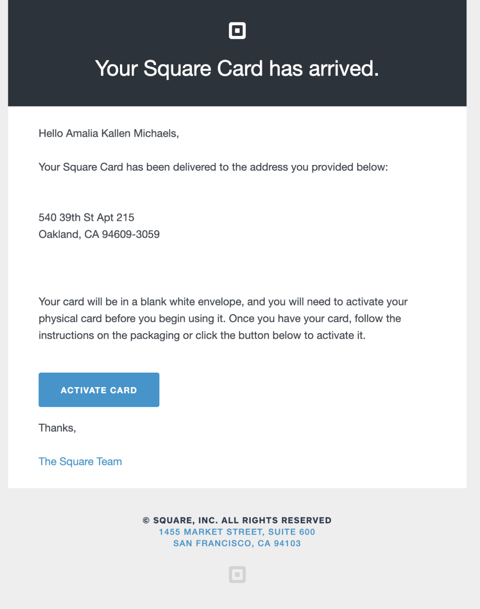
Before: Inconsistent email designs across departments
Two months after launch, we saw significant improvements in seller confidence and email security.
"I'm very pleased with some of the updates Square has been doing to keep our money safe."
Opening up a new Square email through Gmail
This project proved that visual consistency can directly impact trust and user safety.
The project not only mitigated security risks but also strengthened Square's brand identity. By creating a scalable design system, we ensured that future emails would maintain consistency and recognition across all seller communications.
The success of this project demonstrated how design can serve as a powerful tool for security, showing that visual consistency and clear branding are not just aesthetic choices but critical business safeguards.