
I led the end-to-end UX of our photo-taking workflow, identifying key UX gaps through journey mapping and collaborating with stakeholders to design solutions that improved user experience & increased customer adoption.
Custom workflows were causing too much friction around the photo-taking experience.
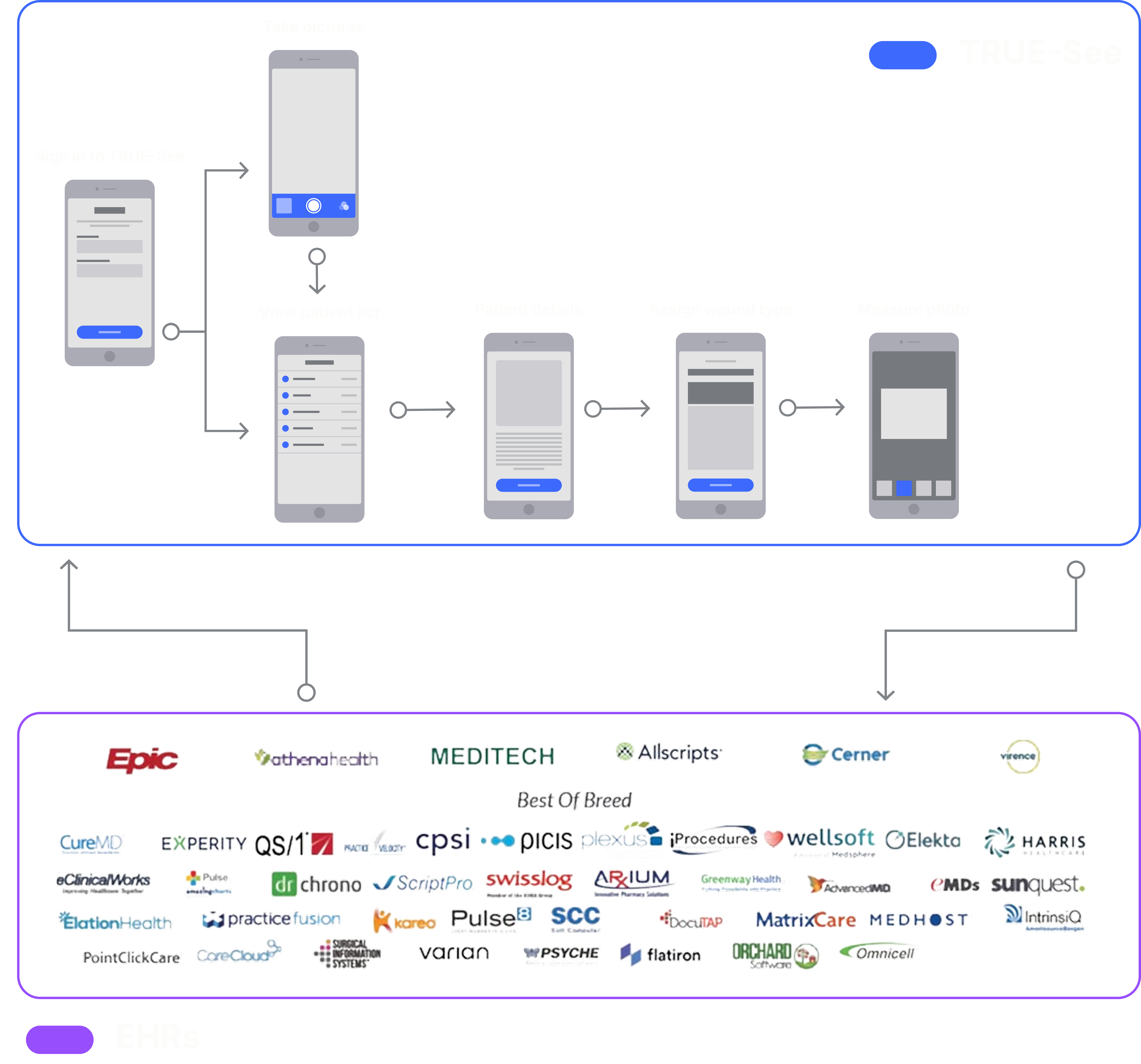
TRUE-See was originally built on tightly coupled Electonic Health Record (EHR) software, which led to friction and limited adoption. In 2025, we transitioned to an EHR-agnostic approach to improve our UI consistency, technical upkeep, and data integrity.
Through this shift, we discovered serious workflow friction while talking to our users. The biggest problem was getting to the camera and taking pictures.
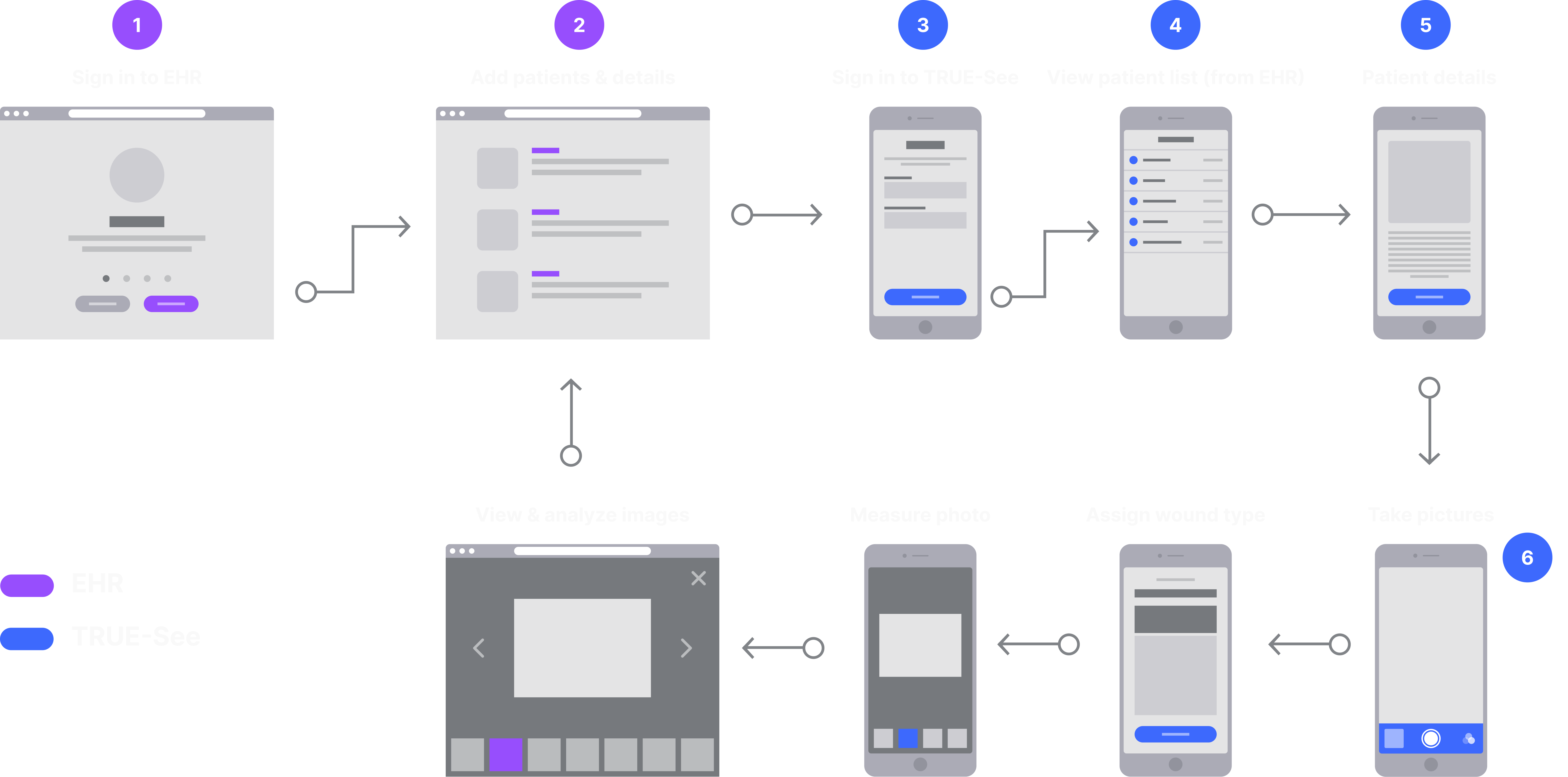
The old workflow required multiple clicks to access the camera
Assuming the patients were already in the EHR, it still took three clicks before they could get into the camera. If the patient had multiple wounds, the last 2 steps were repeated for every new wound type.
It may have only been a few additional seconds of work, but it took a huge toll on the users' sentiment towards the application. It became less trustworthy, less appealing, and less used.
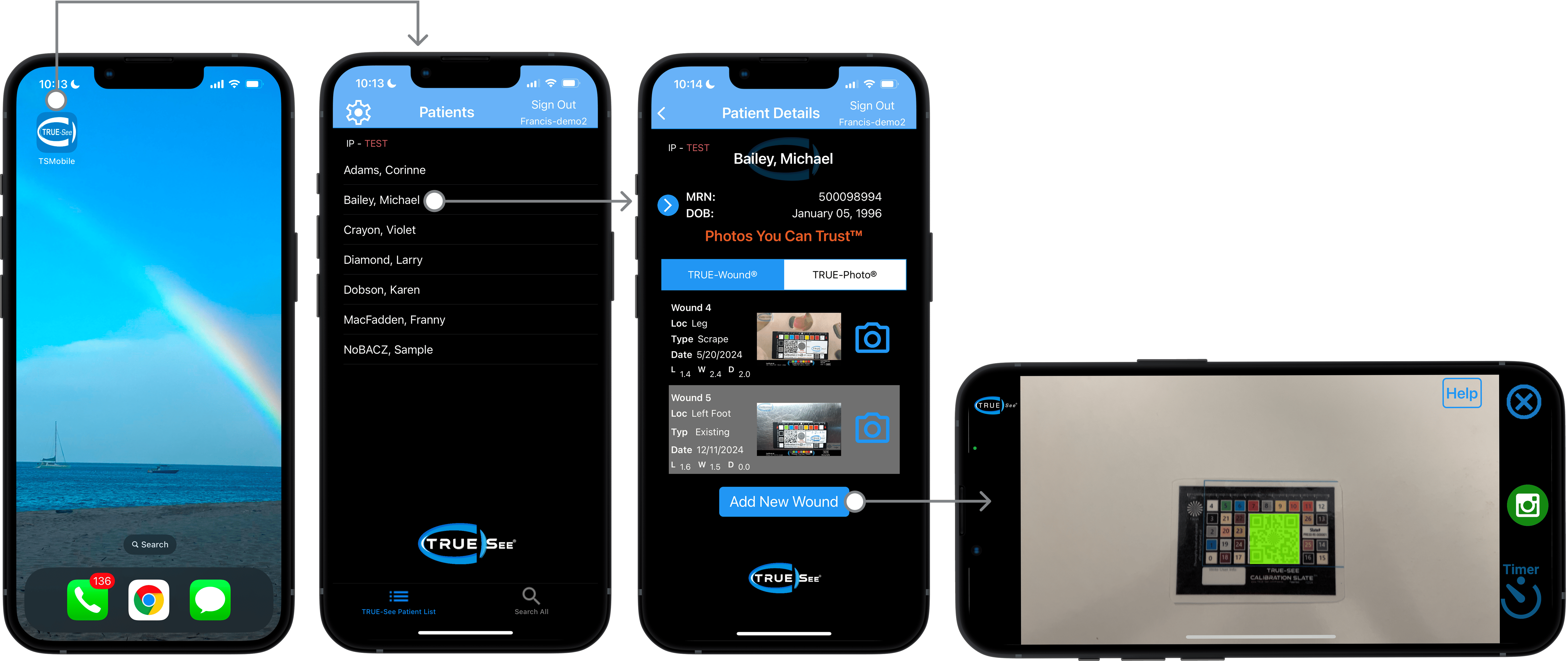
The new streamlined workflow in TRUE-See's standalone app
Our objective was to turn photo-taking into a seamless experience, while still pursuing our business goal of making TRUE‑See's standalone app fully EHR‑agnostic.
We started with simple cosmetic and API upgrades, but research uncovered an opportunity to slash the required clicks in half.
The streamlined photo-taking workflow with bidirectional data flow
Collaborating with our PM and stakeholders was key in prioritizing the design solutions.
Sketching the initial concepts on paper allowed us to quickly iterate on the design and get feedback from the entire team.
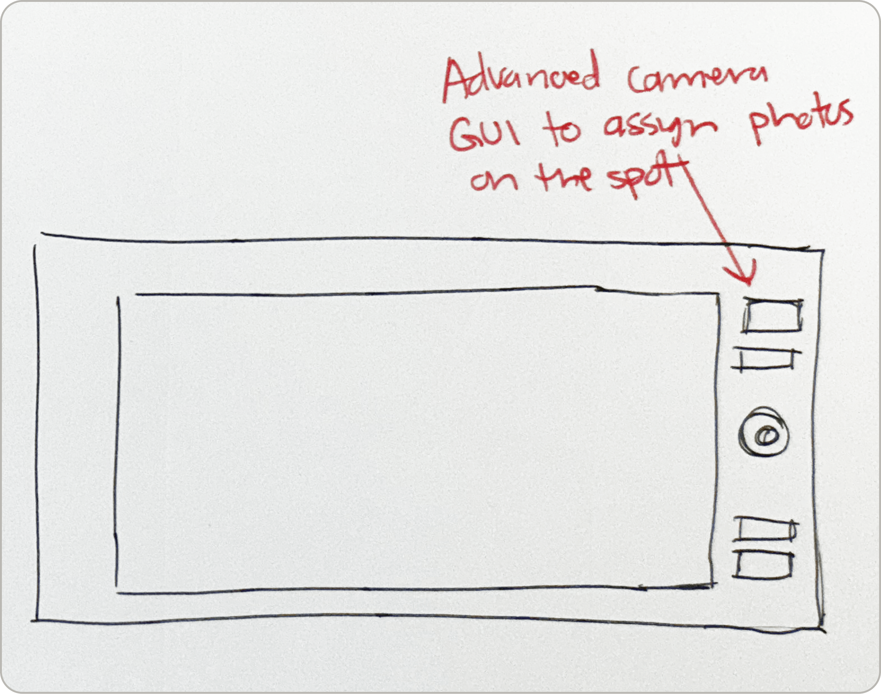
Early sketches visualizing changes to the GUI, and more.
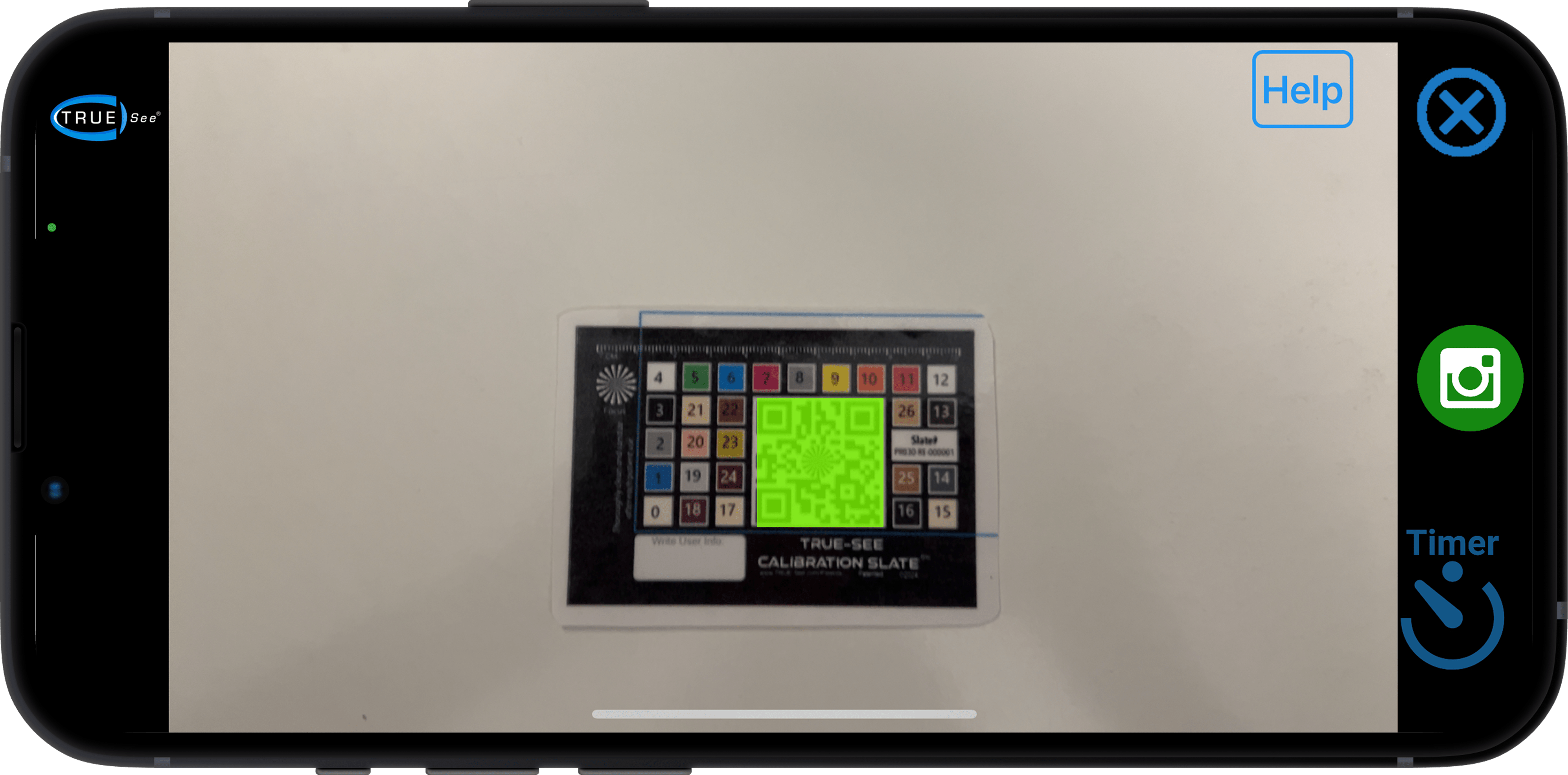
With our old UI, the job-to-be-done was much less clear. We had to explain to users what the green square was, and where their images were being sent. The visual language was confusing and the workflow was not intuitive.
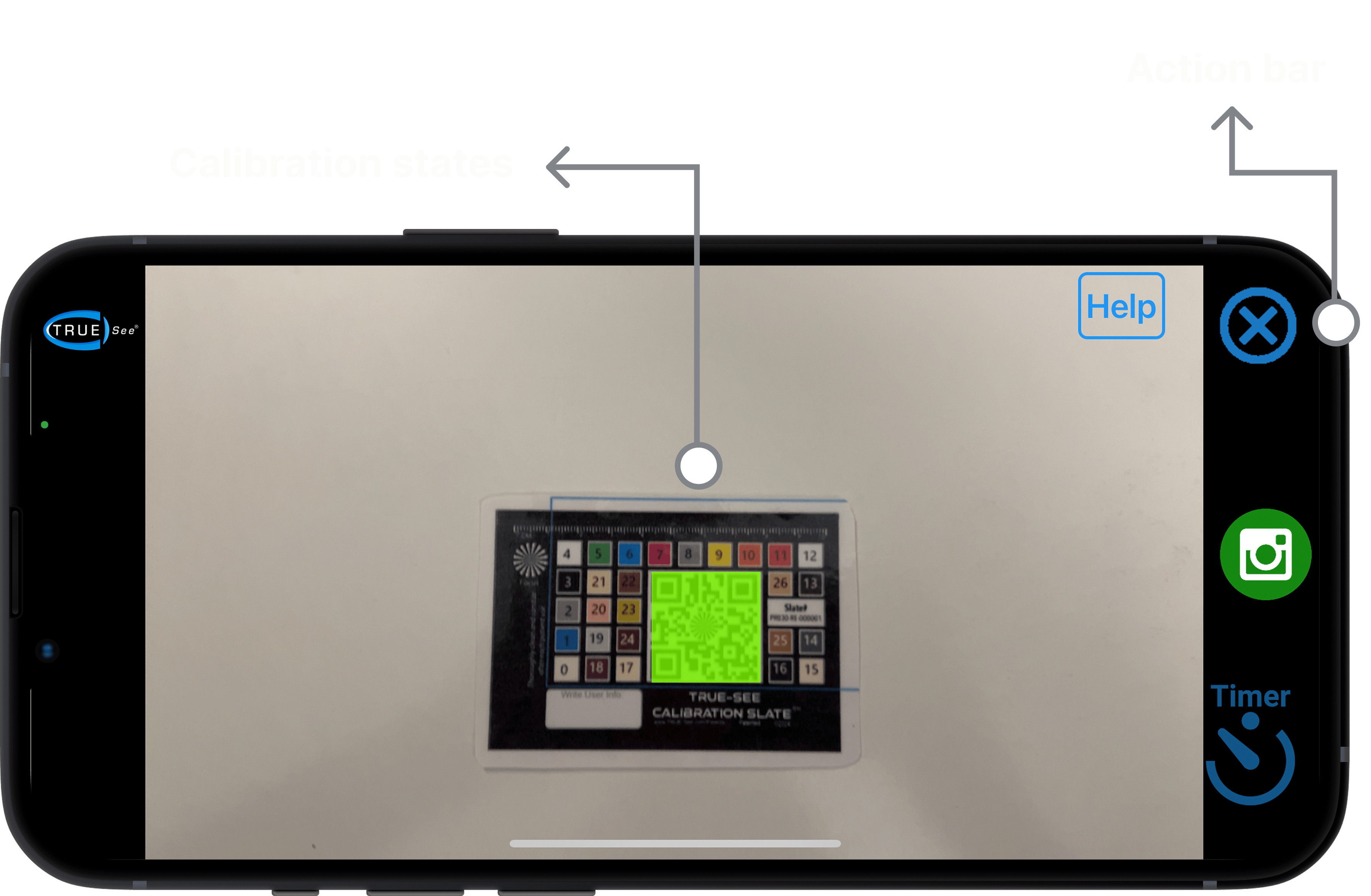
Old UI vs New UI
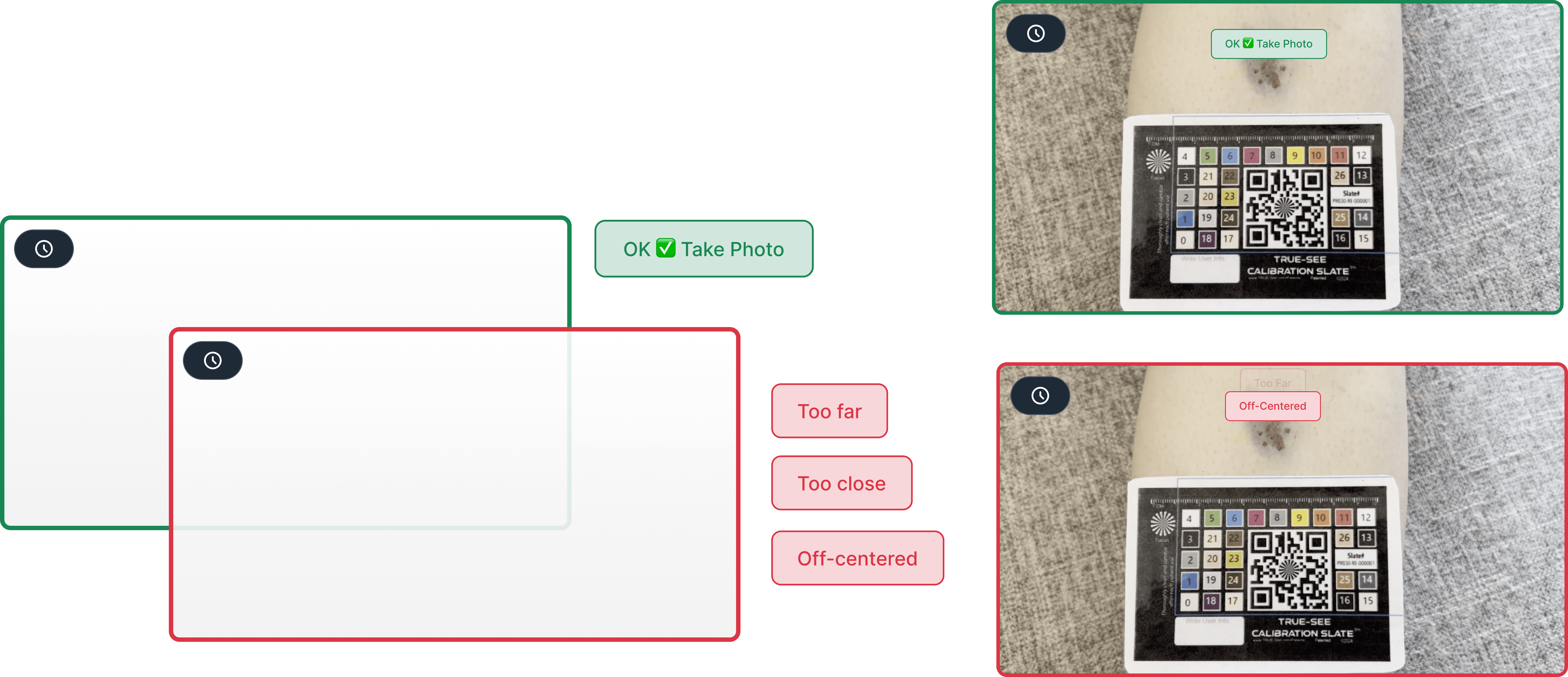
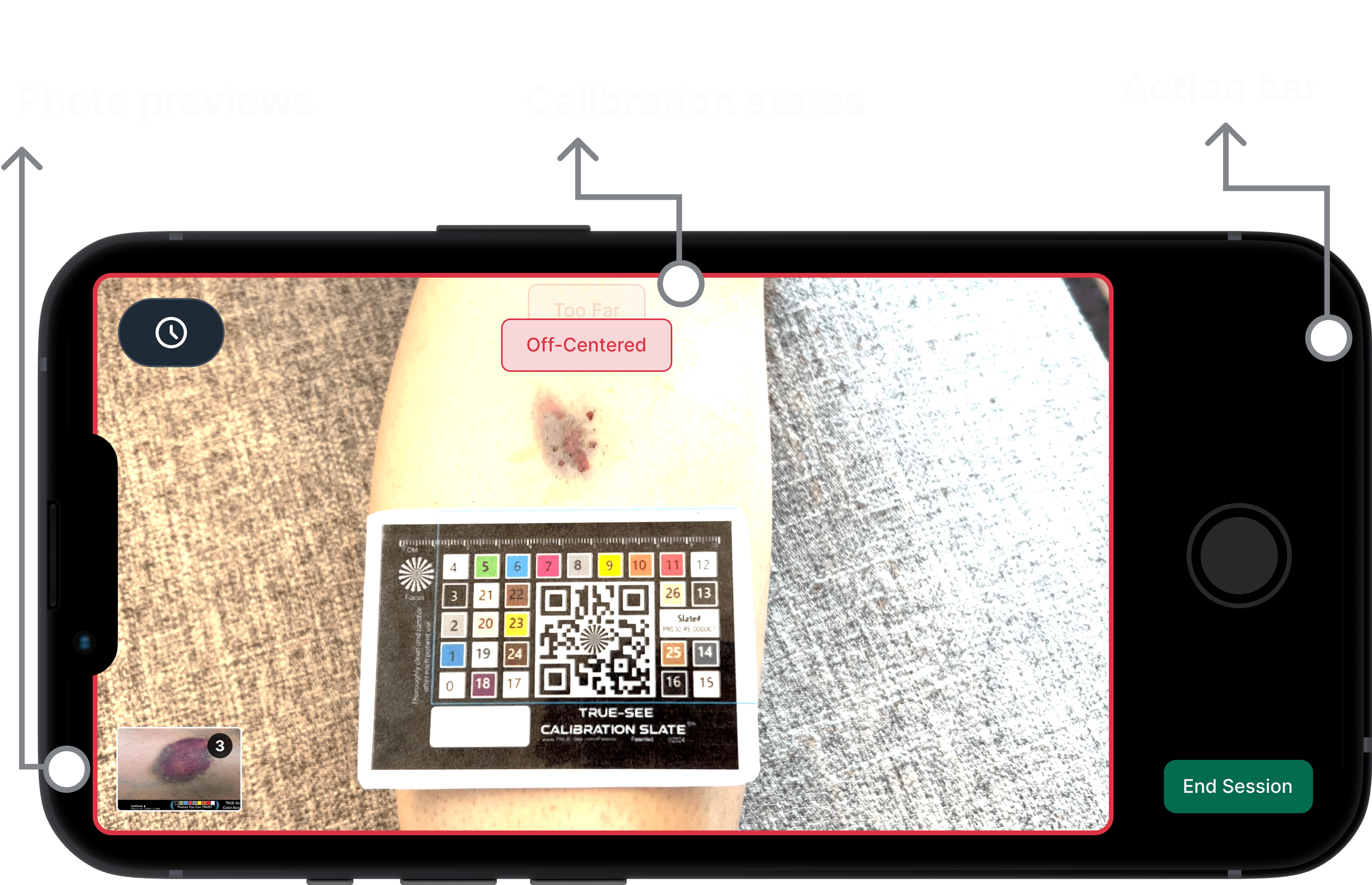
Visual representation of the new interface boundaries and layout structure
User interviews uncovered additional friction around the photo previews, prompting us to A/B test new variants and land on a final design.
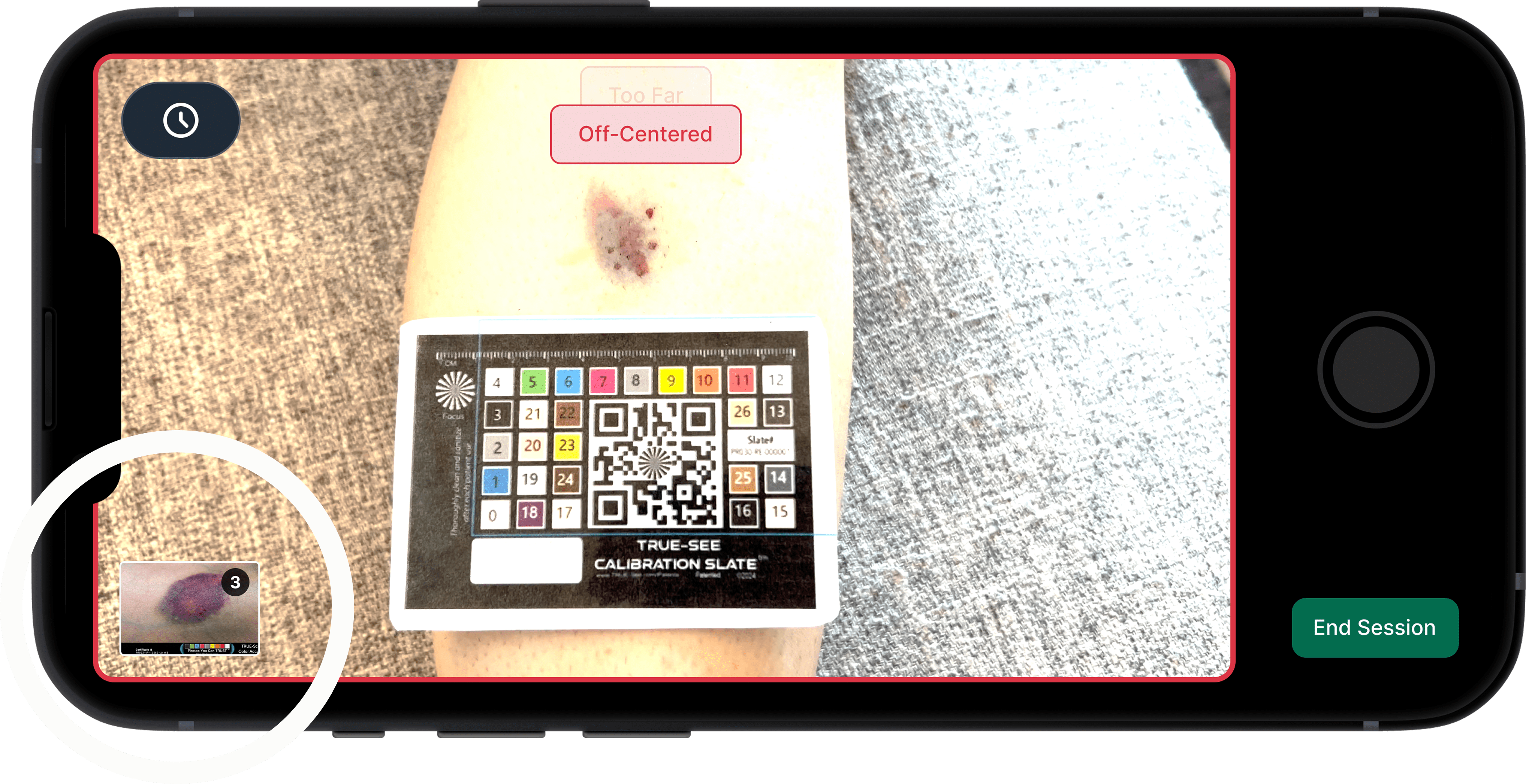
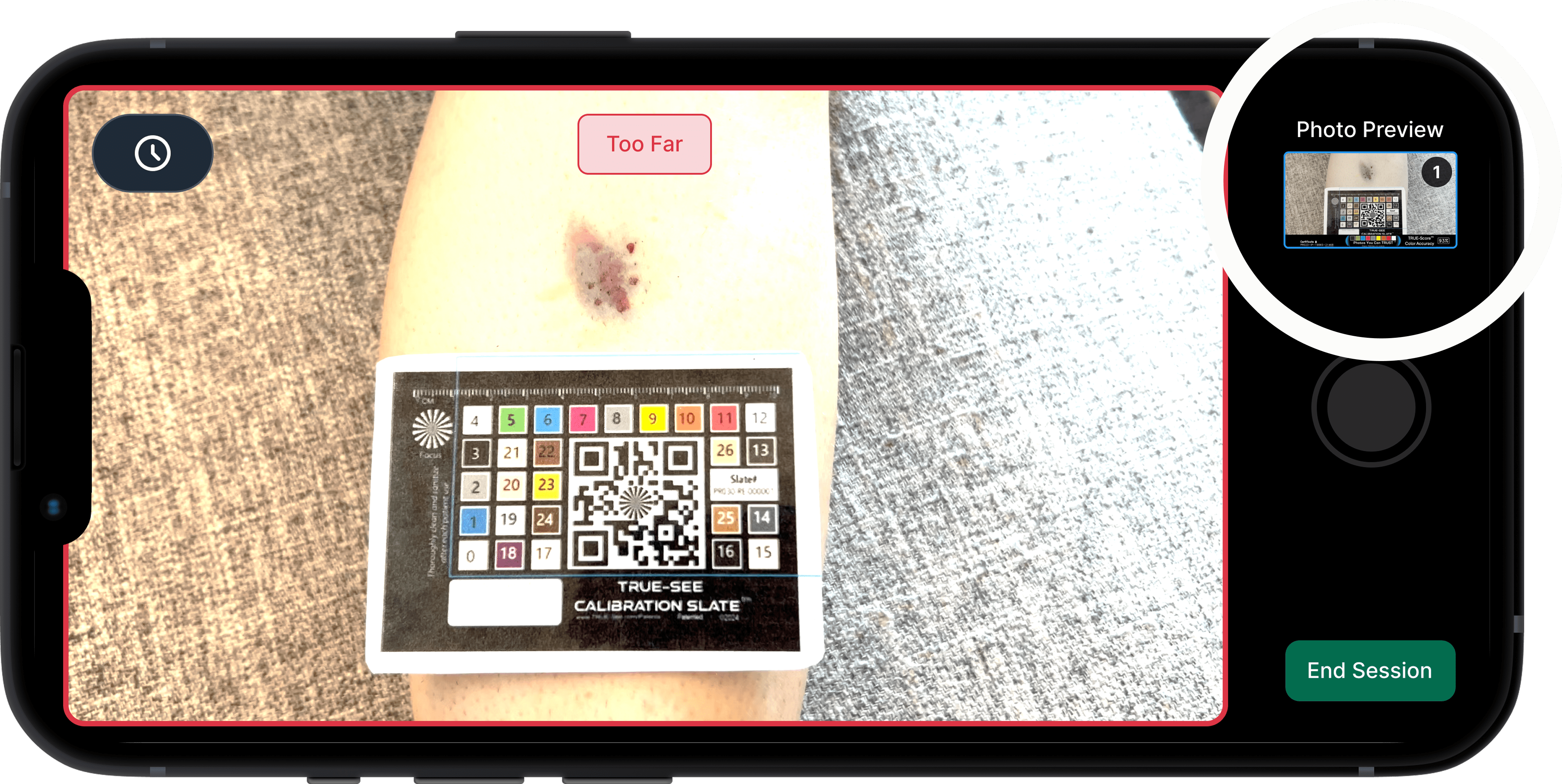
User interviews allowed us to move the photo thumbnail to a more discoverable area, from the bottom left to the top right
Physicians describe the new photo workflow as fast, efficient, and intuitive. We took a 6-click workflow down to 3 clicks.
" Definitely works a lot faster when you have [the camera] upfront "
" I can see this working for a patient with multiple wounds, which was always my issue"
" The red borders on the outside make way more sense [than before]"
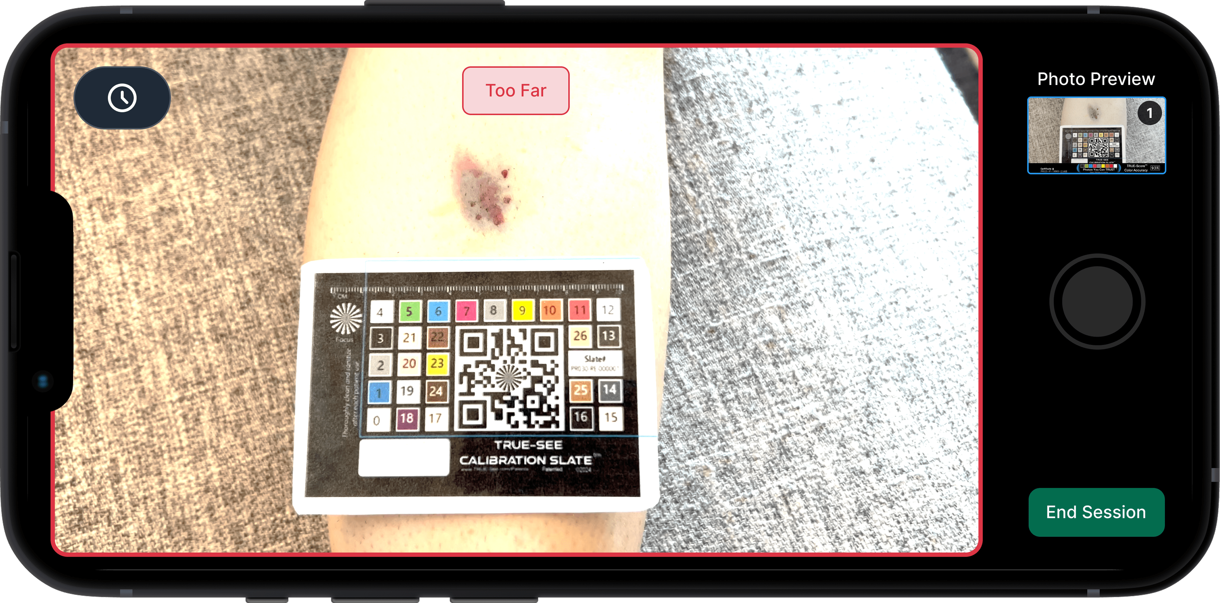
From left to right, showing the UI changes we made throughout this discovery journey
This project demonstrated the importance of designing for flexibility in healthcare technology. By decoupling from specific EHR systems, we created a more adaptable solution that better serves both healthcare providers and patients.
Looking ahead, we're excited to continue refining TRUE-See based on user feedback and expanding its capabilities. Our goal is to make wound documentation more efficient and accurate for healthcare providers while improving the overall patient experience.